A Field of Meanings
Sometimes you put your stamp on things, other times they put their stamp on YOU.
Hike through a park or preserve or just take in the view from a nameless roadside turnout. Maybe there’s one main subject that catches your eye, but other times there’s a whole woven world out there. A habitat.
Now think of how you’d render your experience as, say, a photo print or a painting. Lots of choices: big and small, near and far. Simple and complex. Or maybe all those things at once? Really, what exactly is “subject matter?” And what makes “meaning?”
One way to start getting better at composition is to first strip things down. Simplify, simplify, simplify. That advice certainly helped me. Subject. Background. No clutter.
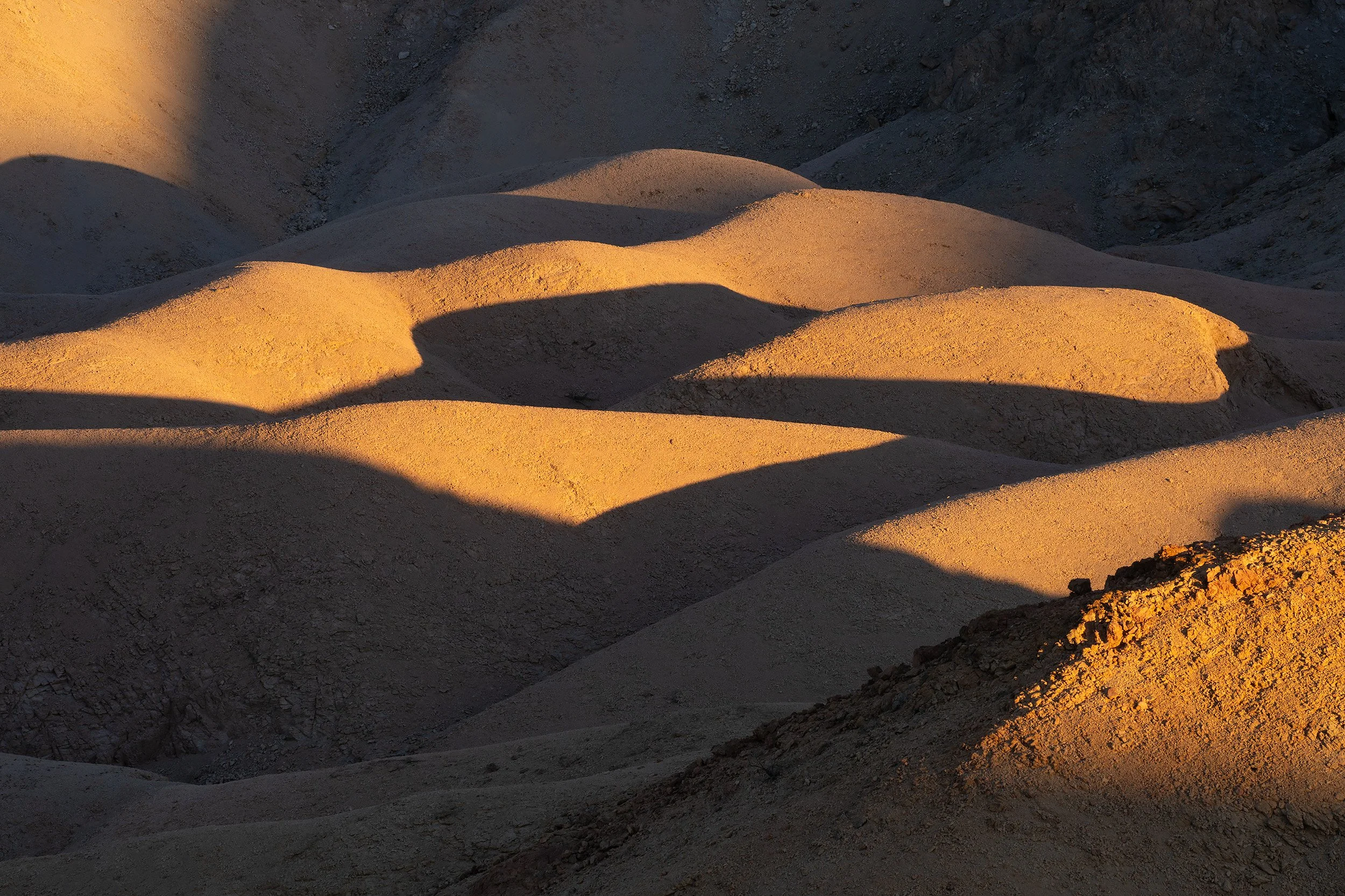
And that’s not just for details: Landforms are also primary gestures and emotions, even from a distance. Like the curves of desert hills.
I’m sometimes jealous of painters who can choose the level of what I’ll call “infill” between broad, bold outlines. Take a look at “color field” painters like Helen Frankenthaler, Clyfford Still, Mark Rothko, or Frank Stella. Or check out “lyrical abstraction.” This is meaning in broad strokes. (Even if the intent was no meaning!) There’s no scale, no context, no window out of the frame.
And onward we go to minimalism.
OK, that’s one direction…But sometimes the colors and textures of native landscapes won’t fall into simple compositions of “main subject” and “background.” Or rest on those broad strokes. Instead, things coincide or coexist. Habitats, ecologically speaking, may have scale up and down. With life at every level, in two dimensions and in three. All things floating and bobbing on the same sea: left to right; front to back. And we’re seeing through things, like winter branches, to what’s beyond. The real world is often a tangle. A polyrhythm of chromatic shapes. A fractal scroll tapestry.
In this mode, maybe “subject” is an overall accumulation or an involvement of shapes, colors, textures, and details. “Meanings” are found in the energy or stillness of all that—plus your own immersion in it. It’s a matter of feeling.
Call this another kind of field composition. Balance vs. Imbalance. Additive, not subtractive. Inviting in a little bit of chaos…or even a bit more. You’re saying to the world: “I’m open.”
Classic 4x5 and 8x10 view cameras are really good for these types of images. Early digital? Not so much, there was no there there. Walk in to look at a print on a gallery wall and it turned to mush, devolving into over-sharpened, distorted “colors by numbers”—with blurred noise like partly-melted candlewax inside those haloed outlines.
But it’s gotten better. Whether it’s film or digital, if it’s detail you’re after, the camera is your friend.
While I often choose to strip scale and context from my own images, at some point I might ask: “Is it TOO simple?” Maybe start by paring down, and then—if your world warrants it—begin to slowly build back up again. Just having this dialogue can help you sort out your take on things. I do this all the time.
And what about having it both ways? Color field or lyrical abstraction when viewed from a distance, and fractal colors and textures up close?
Or as Russell Chatham said to Anthony Bourdain, over a dinner of sage grouse or some such: “A painting is to be seen from three distances: 30 feet; 3 feet; and 3 inches.” Exactly! Just like one’s eye tracking across the landscape, or through a museum or gallery, then pausing and moving in for a closer look. And finding new worlds at every level.
Meanings are everywhere. Add them up—or don’t. It’s your call.
By Scott Atkinson
Contents copyright 2026. All rights reserved.